Note
Go to the end to download the full example code.
Grouping data by category
 run this example as a notebook — or grab the .ipynb (also linked at the bottom of the page)
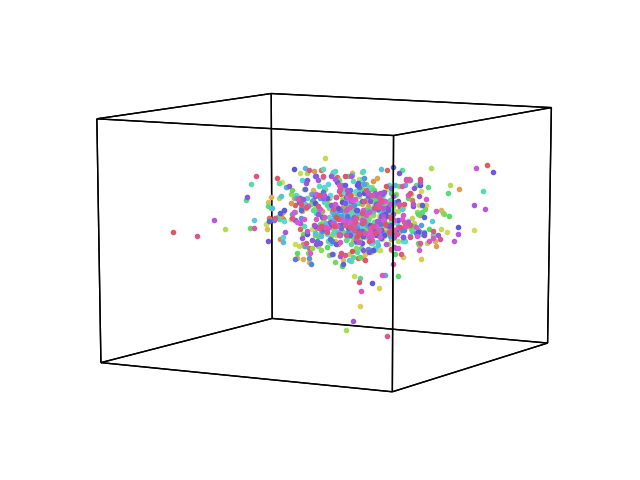
When plotting, its useful to have a way to color points by some category or variable. Hypertools does this using the hue kwarg, which takes a list of string category labels or numerical values. If text labels are passed, the data is restructured according to those labels and plotted in different colors according to your color palette. If numerical values are passed, the values are binned (default resolution: 100) and plotted according to your color palette.
/home/docs/checkouts/readthedocs.org/user_builds/hypertools/checkouts/latest/hypertools/plot/backend.py:1353: UserWarning: Failed to switch to any interactive backend (TkAgg, QtAgg, Qt5Agg, Qt4Agg, GTK4Agg, GTK3Agg, WXAgg). Falling back to 'Agg'.
  warnings.warn(BACKEND_WARNING)
# Code source: Andrew Heusser
# License: MIT

# import
import hypertools as hyp
import numpy as np

# load example data
data = hyp.load('weights_sample')

# simulate random groups (seeded so the figure is reproducible)
np.random.seed(123)
hue=[]
for idx,i in enumerate(data):
    tmp=[]
    for iidx,ii in enumerate(i):
            tmp.append(int(np.random.randint(1000)))
    hue.append(tmp)

# plot
hyp.plot(data, fmt='.', hue=hue)
Total running time of the script: (0 minutes 0.094 seconds)